Documentary
/
Maps
/
Titles
Troubled Water
/ About the project
Troubled Water is a feature-length adventure documentary following two friends on a 425-mile stand-up paddle journey through the Great Lakes, joining the fight to shut down Line 5, one of the most threatening oil pipelines in the country. Nobody wanted the dark, ominous look that tends to follow environmental documentaries. Director Davis Huber brought me on to build the full cartographic and motion graphics package from scratch and to find what the alternative actually looked like. The answer we landed on was grounded and nautical-inspired, modern and information-first, and it set the visual language for the whole film.
/ Credits
Client:
Independent / Dir. Davis Huber
Role:
Main Title & Graphics
Scope:
Art Direction, Cartography, Motion Design, Visual Effects
Tools:
After Effects, GeoLayers 3, Mapbox Studio, Premiere Pro
/ Year
2023 (Broadcast on PBS 2025)
01
Art Direction & Cartography
Designing a Map That Wasn't Dark
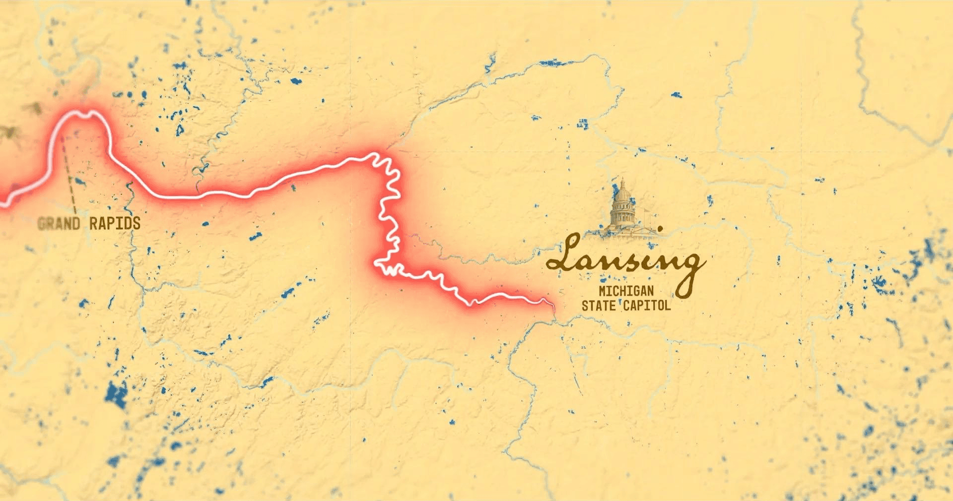
Environmental documentaries almost always reach for the same dark, ominous map. That was the first thing to solve. I wanted something that felt modern and alive, grounded in the water itself: a warm, hand-lettered, nautical look with ochre landmasses on deep blue water and route lines that felt drawn rather than plotted. It carried the information without the doom.
This was my first time in Mapbox and GeoLayers, so I learned both quickly to build the map I had in my head and had pitched. I designed the base map in Mapbox, handling the terrain, borders, and topography, then pulled it into After Effects through GeoLayers and did the styling that gave it character: color grading, a posterized paper texture, and hand-placed labels for the Great Lakes and Canada so it read like something off an old globe.
Base map: Designed custom terrain, borders, and topography in Mapbox Studio.
After Effects styling: Graded the color, added the paper-grain texture, and hand-set the map labels for a globe-like feel.
Dual-map luma workflow: Exported a high-detail map alongside a black-and-white luma matte so I could style land and water independently in After Effects.
02
Concept & Design
Solving the Frame with "Journey Cam"
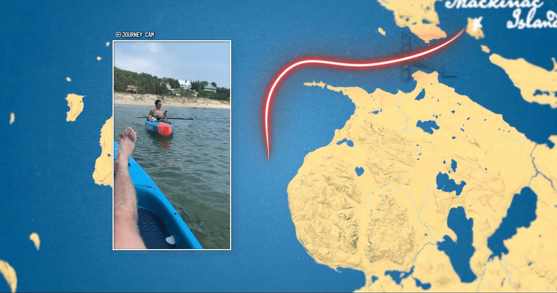
The film had a framing problem. Davis had vertical phone footage from the paddlers and didn't want to drop it into a 16:9 documentary with big black bars down the sides, but the team still wanted that footage on screen. On top of that, the map risked feeling static between beats, and the early thinking was just to cut back and forth between the phone video and the map.
My solution was to stop treating them as two things. Instead of cutting between footage and map, I designed a framed portrait window I called the "Journey Cam," with the vertical footage sitting inside the live map and the paddle route drawing on in real time around it. The vertical format stopped being a problem and became the point: one shot showed what the paddlers saw while the map stayed alive with the journey moving across it. It took a lot of design and iteration to land the look and the behavior.
Then I made it something the small team could run without me. I rendered the animated map and Journey Cam frame as ProRes with an alpha channel, so the editor could lay footage into the window directly in Premiere, adjust timing, and swap clips without ever re-rendering the animation or coming back to me. For an indie production with no dedicated VFX budget, that handoff mattered. I built the lower thirds and titles as a MOGRT suite the same way.
03
Archival & Editorial
What Line 5 Threatens

The film isn’t only about the pipeline. It’s about what two friends and their families have built around this water, and what the generations after them stand to lose. Those reflections needed a different register from the maps, so I built an archival language out of family photographs, documents, handwriting, and aged paper, treated so the memories felt physical and handled rather than dropped into the frame.
The maps carry the scale of the threat. Outside of the environmental impact, this is what’s at stake for them.

04
Information Design
Making the Numbers Land
The film also had to make statistics land emotionally rather than read as a chart. I designed a system for that: state cards, route maps tracing the pipeline, and comparison graphics, including one setting Michigan’s coastline against Florida, California, Louisiana, and Texas so the scale registered instantly. The numbers animate, so a viewer watches the comparison resolve.
05
The Outcome
A Unified Documentary Language
The graphics package gave the film a cohesive visual thread from open to close, grounded, nautical-inspired, and deliberately distinct from the ominous aesthetic that dominates environmental documentary work. Davis and the team felt it was right for the story. The film went on to broadcast on approximately 80% of PBS stations nationwide, reaching an estimated audience of several million viewers, with additional support from Patagonia. It has been available to stream free on the PBS app since October 2025.